This code component + override allows you to create a collapsible sidebar in Framer that remembers its state (closed/open) when you change page.

How to use
I recently developed a code override to create a collapsible sidebar in Framer for my personal site.
The override also uses cookies to make the component “remember” its state (closed/open) as you navigate the website.
The setup can be quite tricky so here's a step-by-step guide to make the process much easier for you:
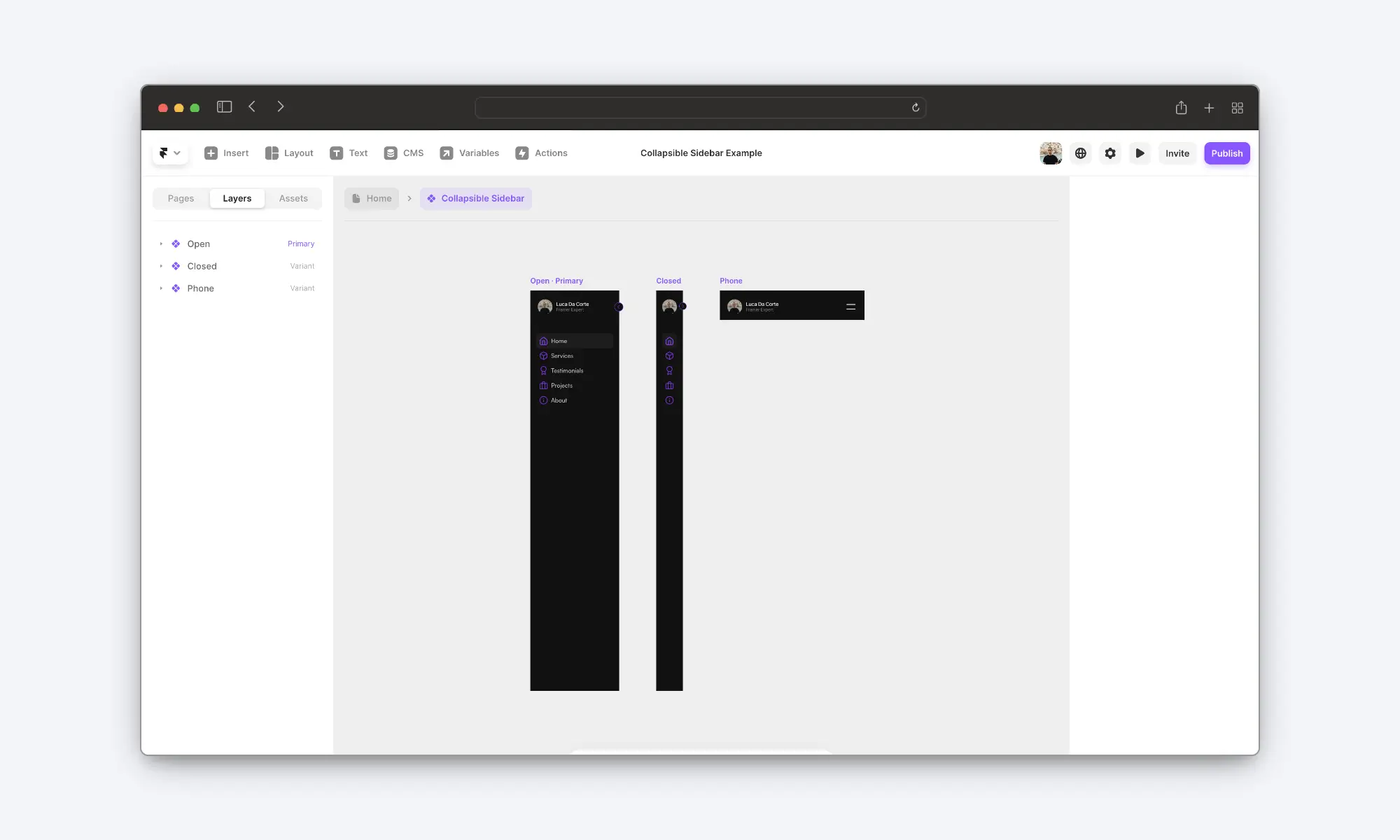
1. Create A Sidebar
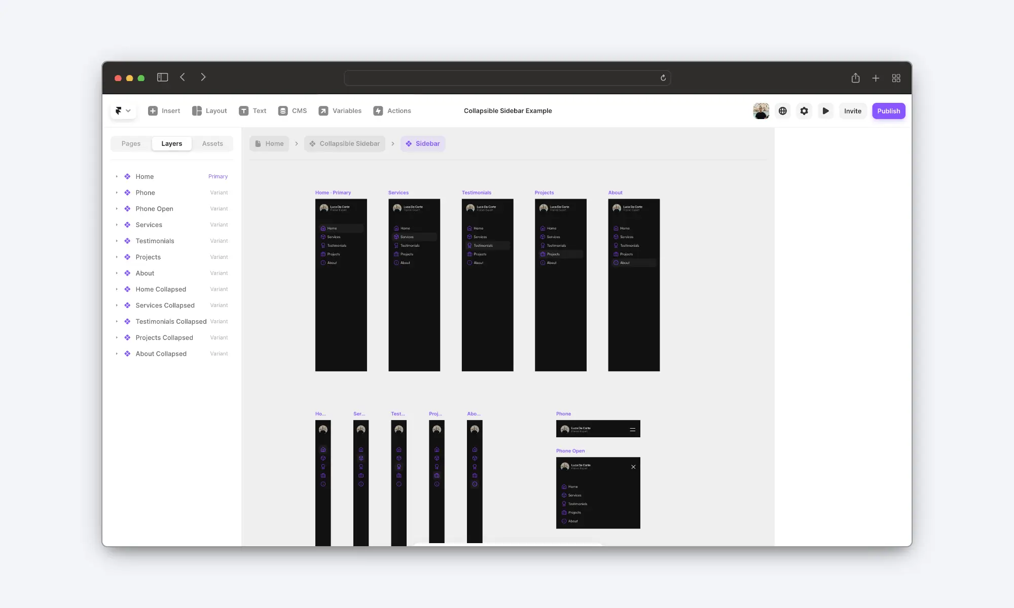
The first step is to create a sidebar and make it a component.
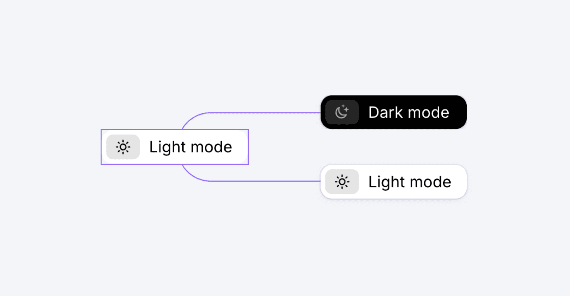
If, like me, you want to make the current page stand out with a different styling, you’ll have to create a different variant for each page you have.
Then, you’ll have to duplicate the number of variants to create a collapsed state (for each page).
Finally, you’ll create a version that works on mobile devices.
For example, in the sample project I’ve created, we have five pages and eleven different navbar variants:
Five for the “open” state (one for each page)
Five for the “closed” state (one for each page)
One for mobile devices.
Once you set up your navbar, it’s time to move on to the next step.
2. Create a Collapsible Sidebar
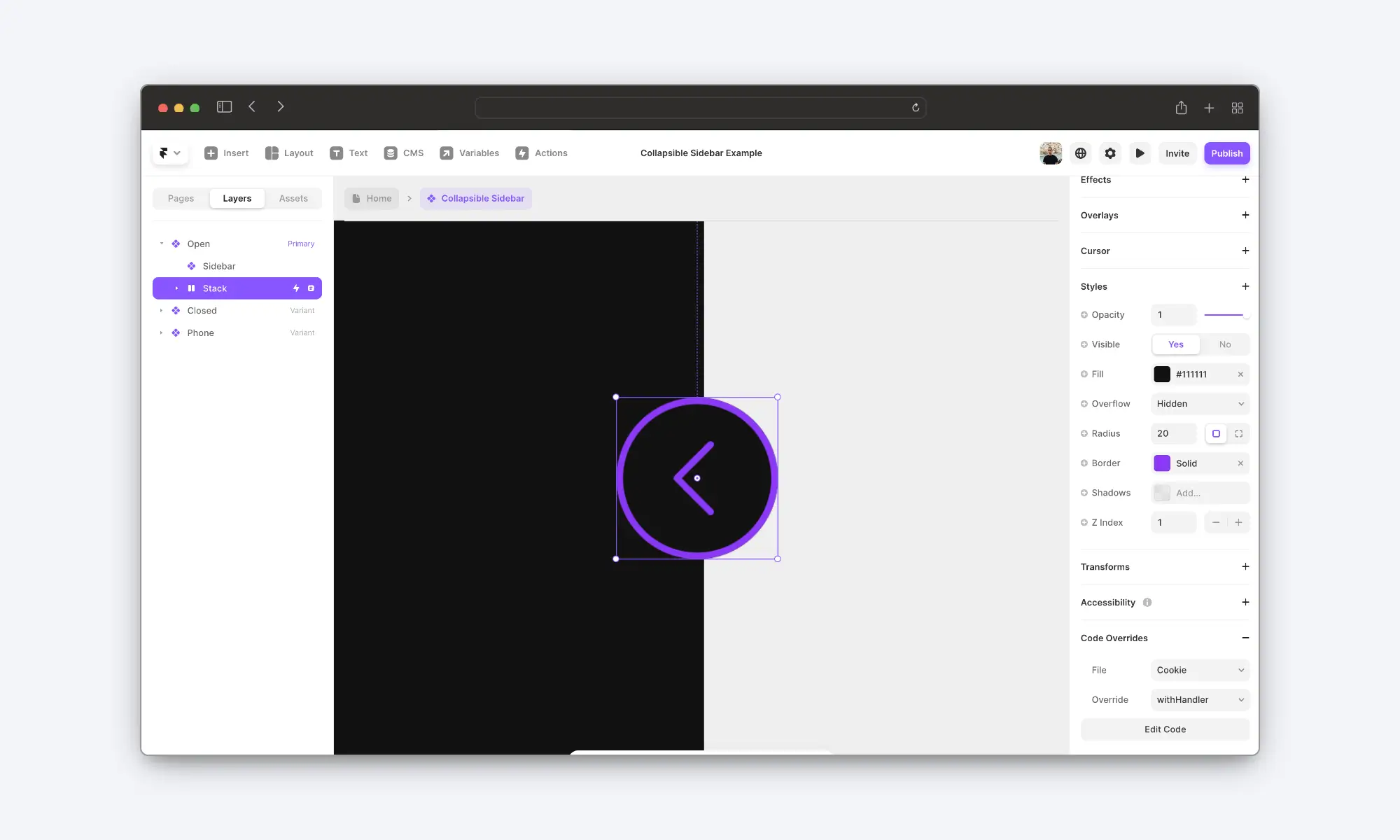
Now that you have your sidebar in place, it’s time to create the collapsible sidebar component.
To do that, create a component that wraps the navbar and adds a small button to collapse/expand it.
This new component will only have three different variants:
One for the “open” state.
One for the “closed” state.
And one for the mobile view.
Then, create two variables that you’ll use to choose which variant of the sidebar you want. You have to make two and not one because the variant for the “open” state will be different from the variant for the “closed” state.
Lastly, add a tap interaction to the button to switch between the “open” and the “closed” state.
If you’ve done everything right, you should now have a functional collapsible sidebar. However, the major problem is that it doesn’t remember its previous state when you change the page.
So, if the user closes it and then changes the page, it will return to the “open” state.
And here’s where the code override comes in.
3. Add The Code Override
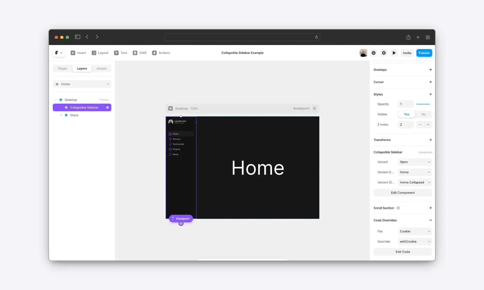
Now that we have finished the setup, it’s time to add the code override to make the component remember its state as you navigate the website.
Add a code override to your project and name it whatever you like. In my example, I’ve called it “cookie”.
Then, paste in this code:
This code override has two functions:
withCookie
→ This function reads the browser cookies to see if there’s a saved state. If there is, it will switch to the correct variant accordingly.
→ We will apply this function to the entire component (collapsible sidebar).
withHandler
→ This function is triggered when the user clicks the button, and it toggles the saved state in the cookie (if there’s none, it creates a new entry).
→ We will apply this function to the button that makes the sidebar collapse/expand.
Now, return to the canvas and apply the “withCookie” function to the entire component and the “withHandler” function to the button inside it.
You’ll have to set the “withCookie” function for every component instance. This means you’ll need to repeat the process for every page you have.
Everything should now be working perfectly.
But before you go, there’s one last thing you need to do.
4. Make It Responsive
There’s a small problem with this setup. You can’t use the same instance for the desktop and mobile breakpoints.
If you try to do it, it will look good on the canvas. However, it will break it as soon as you publish it.
For that reason, you must use a different instance for smaller breakpoints.
All you have to do is add another collapsible sidebar (do not apply the code override to this one) and show it only on tablet or mobile. At the same time, show only the desktop one on bigger devices.
And voilà! You now have a perfectly functional collapsible sidebar.
Thanks for reading!
- Luca
Overview:
This code component + override allows you to create a collapsible sidebar in Framer that remembers its state (closed/open) when you change page.